
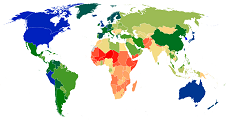
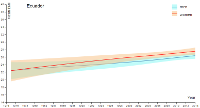
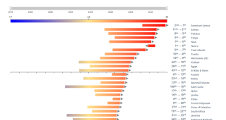
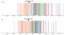
Blood Pressure
| Metrics | Map | Trend plot |
Ranking plot |
Bubble plot |
Stacked plot |
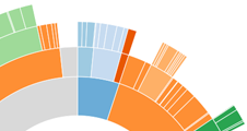
Sunburst plot |
Distribution plot |
|---|---|---|---|---|---|---|---|
| Mean SBP (mmHg) |
 |
 |
 |
 |
 |
||
| Mean DBP (mmHg) |
|
|
|
|
|
||
| Raised BP (SBP ≥ 140 mmHg or DBP ≥ 90 mmHg) |
|
|
|
|
 |
 |
|